
Trending

Written by: Erin M. Hay, CFA
I grew up in Wichita, KS and Tulsa, OK. Smack dab in the middle of Tornado Alley. When I was a kid, every Friday at noon, both cities would run tests on their tornado alarms. Which were just repurposed Cold War nuclear bomb sirens.
If you were from out of town, it was a little disconcerting. But if you were a local and it was sunny or December, you went about your day. Although the fact it was winter was not a guarantee that tornadic activity wouldn’t materialize. Strangely enough, in all my time in Kansas, Oklahoma, and now Texas, I have NEVER seen a tornado. This is akin to someone who grew up in Colorado having never experienced snow. Go figure.
So, welcome to Monument City. This is kinda-sorta our Friday early warning system testing. As a reader, you know not to panic, but to simply acknowledge that we’re monitoring trends in the capital market weather system. But instead of Advanced Doppler and air raid sirens, we’re using Relative Rotation Graphs® (RRG®s) and a Friday blog as part of our radar array.
For the uninitiated, please read our RRG® primer post here. In short, these visuals can give us a bird’s eye view of relative strength in and among the capital markets, highlighting points of strength and weakness.
Let’s first do a mid-month check on stock-to-bond relative strength, a variation of which is a large component of our Flexible Asset Allocation (FAA) model. On a weekly scale, stocks have turned over in comparison to the aggregate bond market, as measured by the $AGG ETF. Not a perfect “comp” for our FAA model, but directionally it works for us.
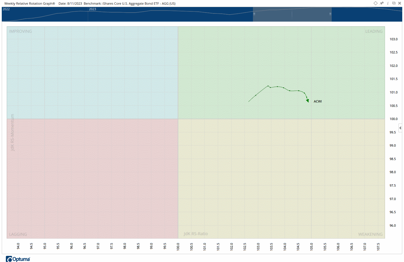
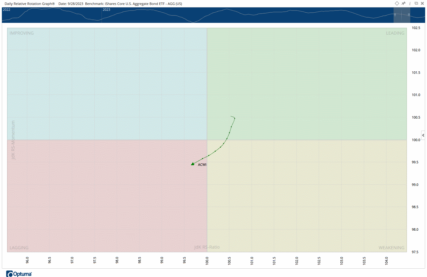
On a smaller timeframe (daily), the relationship has actually started to improve and is heading further into the leading quadrant. Given the disproportionate share of U.S. equities in the construction of the $ACWI ETF, 3Q23 earnings season – in conjunction with ongoing geopolitical events in the Middle East –are going to go a long way in determining the near-term direction of this chart. Remember, this isn’t a rendering of absolute performance, just a relative performance comparison. The $ACWI line may turn up due to strength in stocks and/or weakness in bonds.
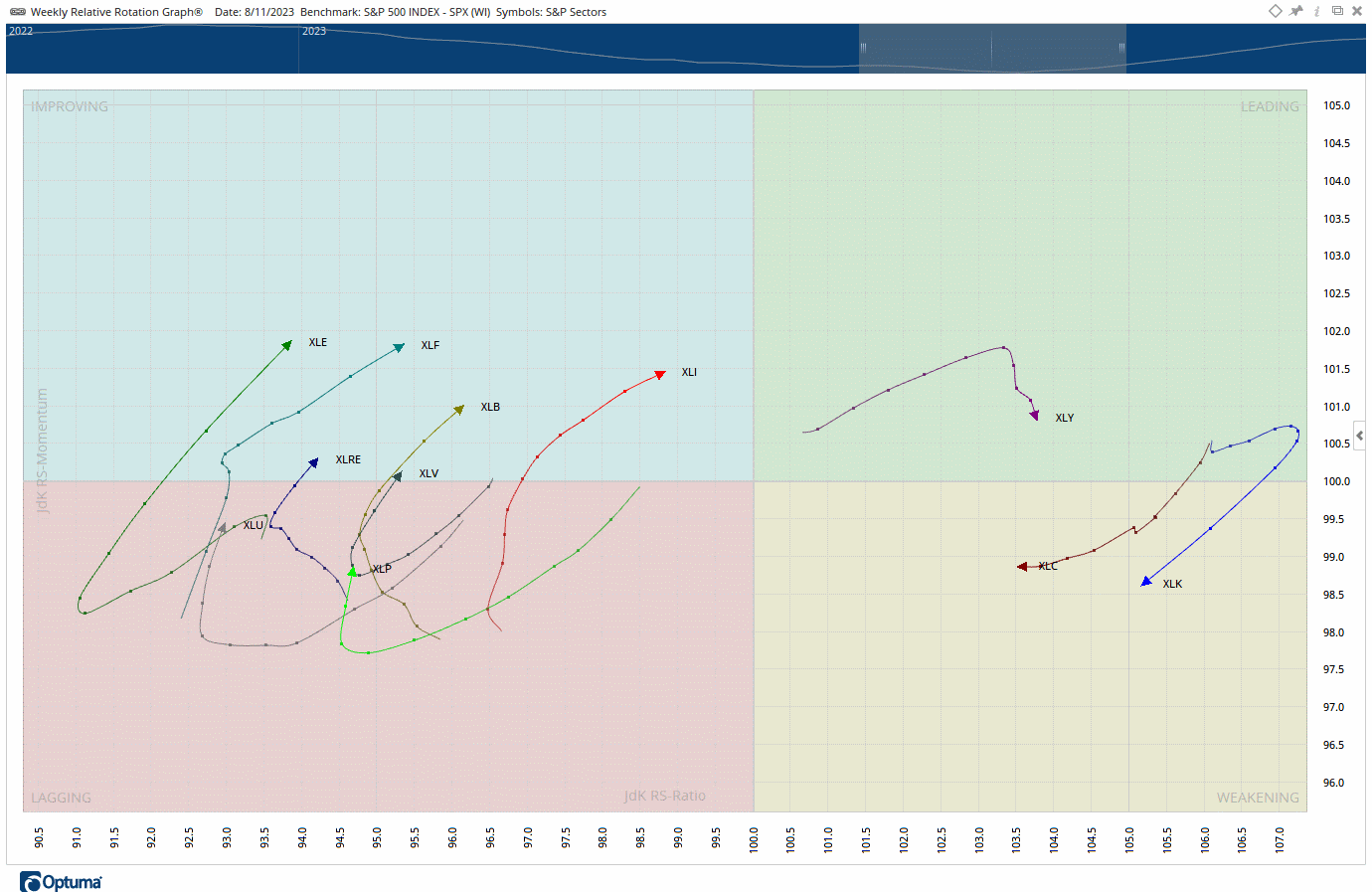
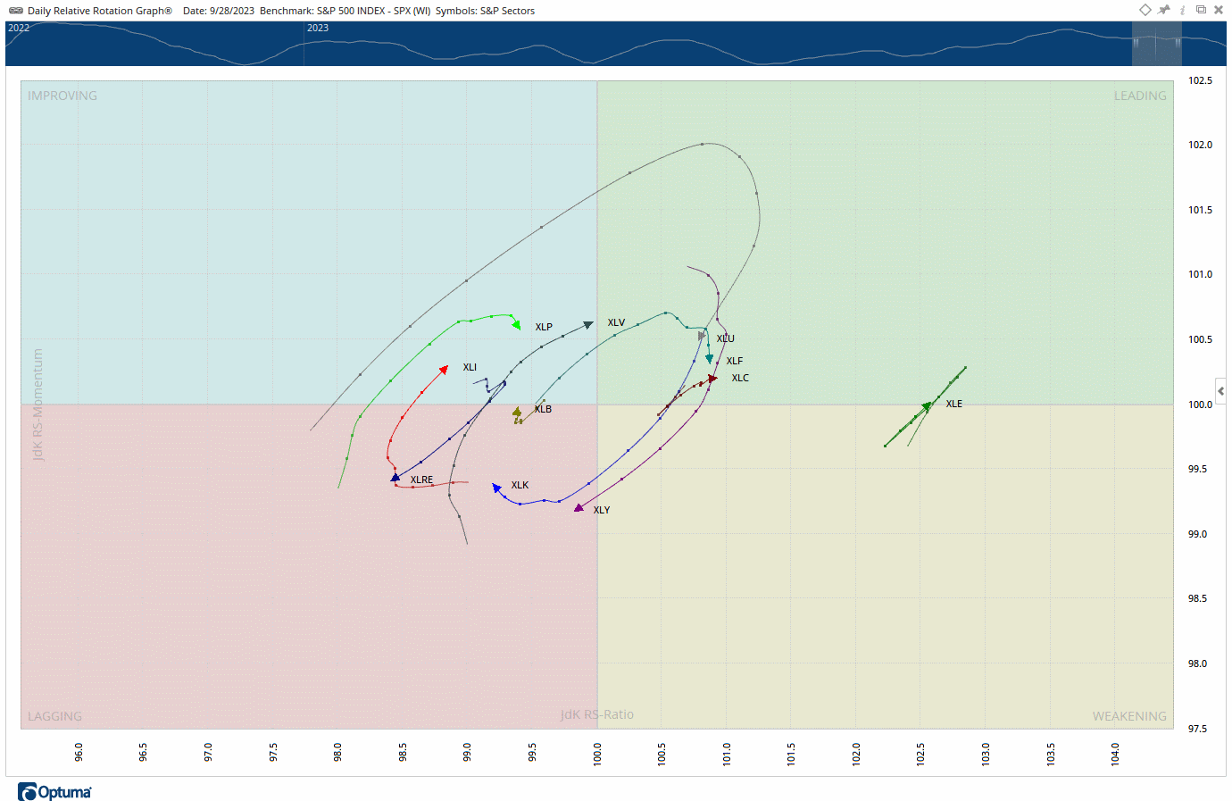
Next, let’s revisit the eleven S&P 500 sectors, which are most relevant for our Core ETF model, where we run a relative strength sector rotation sleeve. In short, there isn’t a ton to love here now, with three possible exceptions (Utilities $XLU, Technology $XLK and Communications $XLC). The trajectory of nearly every sector has turned over, with those notable exceptions.
And after a brutal stretch, likely a function of the race higher in interest rates, Utilities seems to be working off deeply “oversold” conditions as quantified by the short-term RSI (bottom panel of the chart below). The RSI simply quantifies up days versus down days…in this case, over the past 14 days (which is standard). Numbers above 70 are typically associated with “overbought” conditions and 30 with “oversold.”
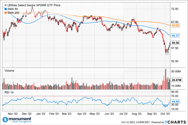
This last bit is even more evident on the daily RRG® rendering, as $XLU’s relative strength momentum has bottomed, with the trajectory headed in the direction of the blue Improving quadrant. In other words: longer-term I have no clue the direction of the Utilities sector, but it is not surprising to see it “bounce” right here.
One final comment to make regarding the U.S. Dollar and seasonality. Recently, a strong USD has been a huge hindrance to stocks, but it appears that the DXY is on the verge of a “failed breakout,” something which would potentially add a tailwind to some favorable seasonality trends. In other words, do not be shocked to see stocks drift higher from here despite the horrific scenes playing out overseas. Especially given the fact that the S&P 500 has bounced off a very important support level, it’s 200-day moving average.