
Trending

How things look in the market depend on how far out we look
-
As I noted last week in cutting the ROAR Score in half from 40 to 20, while things were darkening for the stock market, “the buy the dip era isn’t over until it’s over.” Based on what we’ve seen so far this week, it is not over yet.
-
While I still lean toward this being a “heavy” market with more selling pressure to come, what I try to do to distinguish my approach from the screaming masses is to always look extremely hard to find balance.
-
That means during the best of times, I am looking for what could go wrong, and during the worst of times, I am searching for what to buy. This is in between, as I noted in an article posted today on Seeking Alpha. For those who cannot see the article, note below that you can get a discounted subscription through the link we provide.
-
One key stat from a table I created: every stock in the S&P 500 has had at least one drawdown of 20% since the pandemic started impacting the markets back in February of 2020. And the average “maximum drawdown” of an S&P 500 stock was 47%. And this was the “good” part of the global stock markets, well ahead of small caps and non-US stocks.
-
And since the start of 2022, about half the stocks in that index are down, including dividends. And only 38% of them have annualized at least a 5% return over that nearly 28-month period.
-
Summary: I continue to conclude that the stock market is not some runaway train that I should feel compelled to hop on immediately. That’s why ROAR is down at 20 and not over 50. And why it has not been at 50 or higher for some time. As I see it, we have spent the last year and 4 months simply recovering from a horrendous 2022 for stock and bond markets. Recovering losses is certainly a good thing. But I’ll need more evidence before concluding that this is a brilliant new bull market, and it’s “everyone in the pool.”
CHARTS THAT TELL THE STORY RIGHT NOW
OK, now to that thing about time frames from the title of this week’s letter. The trader in me is encouraged by this chart. The bottom shows an about-face Monday and today, following what was a week last week that reminds me of the prelude to some pretty big drops.
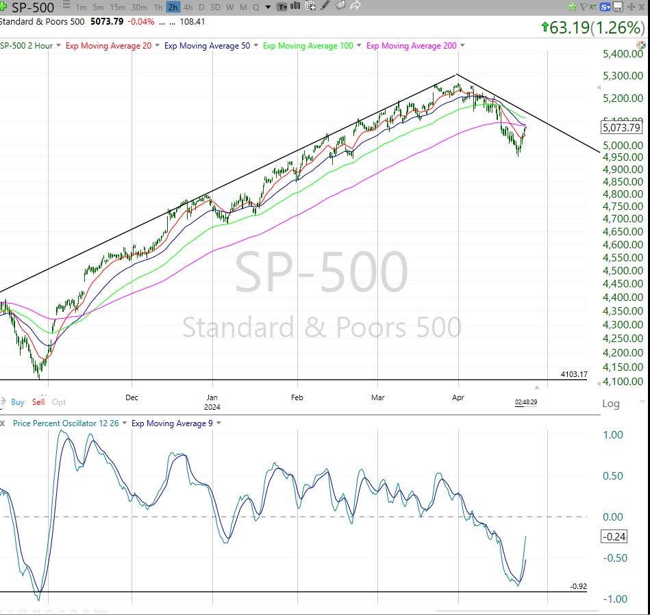
But I’m more investor than trader, so this chart is still front-of-mind to me. The difference between the one above and below? Above shows 2 hour time intervals, the one below shows weekly prices. Same index, different time frames. Very different pictures.
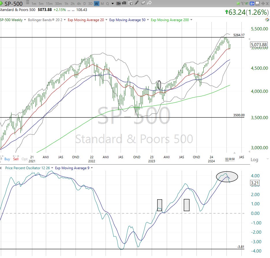
What I take from this: I don’t usually use phrases like “counter-trend rally” but I’ll use it here. That path down to 4,600, or 4,000 or even 3,500 is still a threat. And you know me, I’d rather acknowledge threats than avoid talking about them. We’ll see if the S&P 500 can make it’s way toward flipping some longer-term chart time frames back to positive.
Until then, this is a counter-trend rally. If the clouds go away, I’ll be ready to buy with both fists. But we are a long way from that right now. One big reason…