
Trending

Written by: Reeti Mathur
After learning about the importance of highlighting your brand’s identity in the previous blog, lets now switch gears to actually understand what type of content Financial Advisors must post on their websites and why.
Deciding the content that you publish on your website is very crucial as it is considered the first step in order to retain the interest of your clients. If you display content in lengthy compositions, then the key information or the Unique Selling Points (USPs) of your practice are lost in the ocean. The goal here is to attract your website viewer’s attention by emphasizing on the content sections that actually matter to them rather than posting text-heavy information that can distract them from the main content.
Always start with a pen and paper. Create a basic site map of your website. Categorize the most important information under different webpages including:
1. An About section that throws light on your goals, vision and mission
This is your chance to use the correct keywords and convey the major goals of your firm at the first glance. This information will help your website visitors understand what they are looking for, instantly. You may also include visuals – pictures or even icons that define the goals.

2. A “Teams” page that consists of well-written but succinct biographies
You must definitely consider including a teams page that not just informs the website users about your advisor cohort, but also provides them quicklinks to access the team members’ social profiles (LinkedIn, Facebook, Twitter to name a few) and contact details (the ability to instantaneously send an email or give a phone call to connect).
The biographies that belong to each team member must be succinct. If the descriptions are still lengthy, it is best to subdivide them further into biography subpages of each advisor. The main teams page can have the profile image, name, designations, a short excerpt and the contact details followed by a “Read More” quicklink that takes the users to a separate page containing the elaborate biographies.

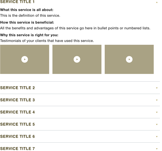
3. A “Services” page that not just talks about the process but also displays testimonials and videos of your clientele that has benefited from those services.
Categorize all the various services that you offer under sub sections. This helps the users to easily grasp the information you are trying to convey. An example user interface to display your services is an expandable accordion which describes each service, its related facts and FAQs to emphasize the what, how and why that service is beneficial to the user.
4. A “Blogs” or “Resources” page that provides a filter to archives and quicklinks to the most recent publications.
Blogs are a major factor to retain the interest of your clients and also to portray your knowledge in the financial industry is up to date. Blogs are one of the parameters that play a crucial role in generating more leads and converting mere visitors into successful clients (more on this in the next blog of this series!). Advisors like you must write on the current scenarios of the financial world – including but not limited to: investment planning, portfolio management, retirement planning, tax planning, wealth management, and community involvement. These blogs can be elaborate, with featured images, videos, and suggestions to another blog of the same category.
To ease the process of your website visitors to quickly navigate to the blog of their interest, it is always a best practice to filter your blogs based on their categories and tags. These categories and tags not just enable your users to filter through blogs, but also improves the Search Engine Optimization (SEO) and reach of your blogs through different search queries on the internet (more on this in the next blog of this series).

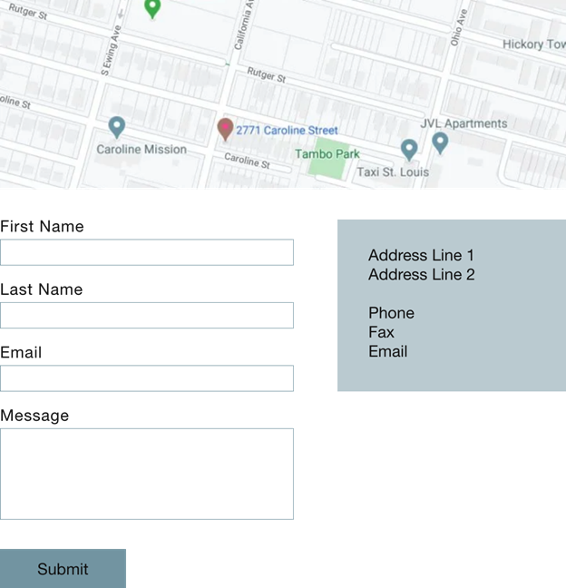
5. A “Contact” page that displays your social presence, contact information, a map where your firm is situated, and a form for prospective clients to reach out.
A contact form is the best way to allow your website visitors to reach out to you regarding any queries that they may have. Using a contact form that has a limited number of form fields/entries is user friendly as your potential client need not fill information that is irrelevant to begin with. You may have an entry each for the first name, last name, email, and a comments box. Based on other additional information which you intend to seek from your users, you may also create a dropdown of options for your users to select from.
Displaying your firm’s address and contact details is considered a good practice on the contact page. If you want to get fancy and more intuitive, embed a google map with the pin dropped at your location. This will instantly take the user to the Google Maps screen on just a simple click.
These are the basic, relevant, and most important content sections that you must consider for your website. Eventually, based on the firm’s requirement, you may always include other content sections that are displayed in unique user interfaces – including but not limited to: flip cards, image carousels, testimonial sliders and events.
Once the website’s structure is outlined, collaborate with a web designer to style your website – keeping the brand identity in mind – and a content writer who can help provide concise verbiage.
While designing your website, it is worth considering the following UX best practices:
- Use images and icons that instantaneously highlight your brand – They always say ‘your first impression is the last impression.’ Use an image on the homepage that speaks about your firm – if you are situated in beautiful Nova Scotia, you may want to include a scenic picture of blue tides.
- Avoid jargon – When you write content, remember that the reader must understand your language. Frequent use of high flown verbiage and technical terms can confuse the website visitor.
- Simplify the look and feel – Never populate a website with a large amount of visuals (images, videos) or paragraphs. Your website visitors will mostly skim through the pages to only grasp the most relevant information. Void white spaces work wonders to create a clean segue from one section to another.
- Interconnect webpages – It’s a good practice to inter link the various content sections using quicklinks throughout your website. This will enhance the reach and engagement of your website visitors (more on this in the next blog of this series).
I hope the second blog of the ‘Reeti Records!’ series has left you with detailed ideas and best practices on the relevancy of the various types of content that you should display on your website. While you are on your journey to renovate your digital presence, stay tuned for my next UI/UX write up.
Related: Using Content to Position Yourself as A Thought Leader