
Trending

Gold prices have seen a nice rise off its March low, advancing over 20% in less than a month. However, I believe that move may be coming to an end.
After testing its 1-year average price at $1450, gold prices have advanced but on extremely week volume. There are several different views I’d like to take with gold, comparing it to oil as well as to Volatility. I’ll say now, some of the charts below have a lot going on but I’ll do my best to highlight the important components and what I think they are suggesting about gold right now
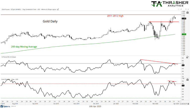
First lets just take a daily view of gold. On the top of the chart, at $1800 is a line noting the prior 2011/2012 highs, which If further upside from Wednesday’s close is seen, could be the next level of resistance, offering little upside potential from the current $1740. After its first day of the new short-term trend, there has not been a single day of volume (not shown) that was above its 50-day average, suggesting a possible lack of institutional-level interest in this latest advance in the shiny metal.
Looking at the middle panel of the chart is the 14-day Relative Strength Index (RSI) which shows a lower high after the recent breakout above $1695, momentum appears to be weakening.
On the bottom panel we have sentiment for gold futures based on the Daily Sentiment Index (DSI). As of Wednesday, gold traders were 73% bullish. Sentiment peaked at 96% back in February and has been making a series of small lower-highs ever sense. Most recently we have another short-term divergence that was followed by a large move lower in sentiment to under 80%. From here I am watching the $1695 breakout, if gold prices fail to hold this level, I think we could see a move back to at least the 200-day Moving Average.
Gold vs. Oil
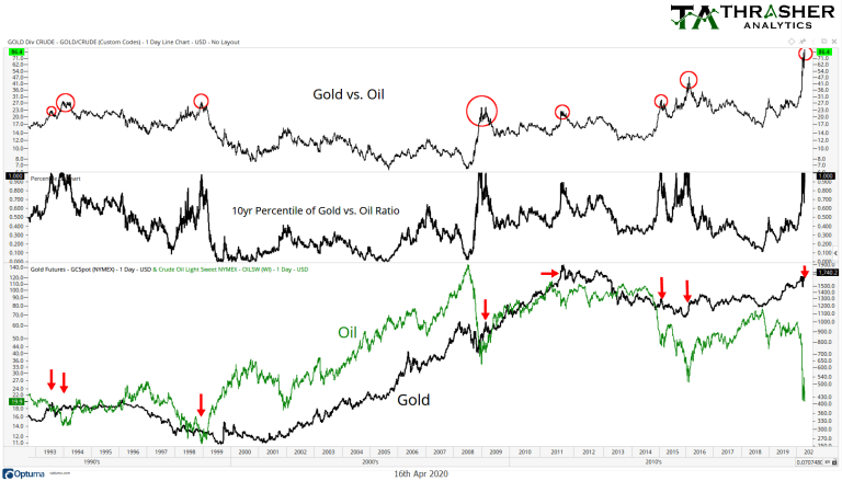
The next chart I’d like to share compares gold to crude oil. The two commodities have an interesting relationship, often trending in the same direction but at times reaching a historically wide divergence. I am measuring the spread between gold and oil using a 10-year percentile, which we current find the ratio at the 100%tile (meaning the highest level in 10 years).
We have been here before, as marked by the red arrows on the bottom panel and the red circles on the top. When we have previously seen such a high percentile between the two commodities, they have historically begun a process of mean reverting – gold declining and oil prices rising. This occurrence comes with oil prices at a near-20 year low and gold sitting just below a mule-year high. I expect we will see a narrowing of this spread in the coming weeks.
Gold vs. Volatility
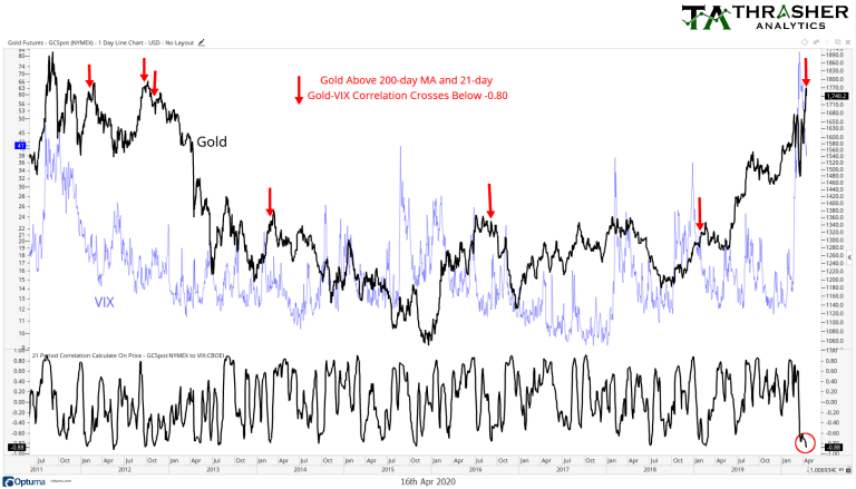
My last chart is one I assume not many people have probably seen before. It’s evaluating the relationship between gold and the Volatility Index (VIX). Both assets are commonly viewed as ‘safe havens’ from the equity market – rising when stocks decline. This suggest gold and VIX should have a positive correlation, and they typically do…until now. Since November, gold and volatility both began moving higher, but in early March gold peaked and saw a sharp move lower for about two weeks while volatility continued to increase. Then in mid-March, the VIX began to decline after it peaked at 80 while gold prices bottomed and started their latest trend higher.
The 1-month (21-day) correlation has now fallen to -0.88, which is the 1%tile (extremely low!). I’ve plotted red arrows on the top panel when the 21-day correlation has fallen below 0.8 and gold was above its 200-day Moving Average, this shows when the correlation has broken down during an up trend in gold prices. This negative correlation has often been short-lived, with gold prices struggling soon after – like we saw in 2011, 2012, 2013, 2016, and 2019. Will 2020 be next?
Upon reading this, surely there will be some that will say “but the Fed!” or “but the national debt and inflation!” – both fair game topics when it comes to gold prices, but I’m a technician and my focus is squarely on the charts and the price action of the underlying asset. As I wrote in the paragraph with the first chart, I’m watching a break below the $1695 area as a sign of price beginning to confirm this bearish thesis.
Related: In a World of Low and Negative Interest Rates, What Is an Investor to Do?
Disclosure: I and/or clients of my firm (FEG) may hold bullish or bearish positions in gold or gold-related investment vehicles.
Disclaimer: Do not construe anything written in this post or this blog in its entirety as a recommendation, research, or an offer to buy or sell any securities. Everything in this post is meant for educational and entertainment purposes only. I or my affiliates may hold positions in securities mentioned in the blog. Please see my Disclosure page for full disclaimer. Connect with Andrew on Google+, Twitter, and StockTwits.