
Trending

Your logo is your firm’s first impression. You want to create a logo that shows off your brand’s personality and really connects with your audience. It creates a feeling for the rest of your webpage and hints at some of your values and services. But creating a logo shouldn’t be a short process. It takes many hours and a lot of thought and money to find the right logo, with some companies spending several million, according to BrandCrowd.
There are several things to consider to make sure your logo stands out and represents your firm. Whether you’re looking to improve your current logo, or creating your first one, we have some of our favorite logos to highlight plus design features that you should consider.
What Makes a Good Advisory Logo?
A good logo targets a specific audience using memorable imagery and typography to evoke emotion and establish brand identity. That’s a very heady description, but in short, it’s how others identify your brand. Let’s unpack what makes up a logo:
- They’re Memorable: Think of a few brands that you enjoy. Does their logo come to mind? What about their logo makes it stand out? Strong logos share some common features, and many of our favorites would fit into several places on this list. But all of them have two things in common:
- Target a Specific Audience: When designing a logo many advisors want a catch-all, but this isn’t effective. You need to target a specific demographic or idea to become memorable.
- Use Imagery and Typography: These are the tools to help your logo target an audience and become memorable. There are a variety of things done with imagery typography, from evoking emotion to demonstrating value.
- Establish Brand Identity: The combination of these three together establishes your brand identity. It’s the information and feeling someone gets from looking at your logo.
Imagery and typography project the emotions and values of a logo. Here are three things to keep in mind when considering yours:
Color Psychology:
Colors evoke an emotion from a viewer. You can highlight certain feelings by using different shades and colors. For this reason, many brands utilize similar colors in their logos, as shown by this study of common color usage from DesignCrowd:

Here are some examples of related meanings for each color:
- Red -Energy, Excitement and Action
- Blue – Trustworthy, Reliable and Secure
- Yellow – Warmth, Uplifting and Joyous
- Green – Natural, Growth and Friendship
- Orange – Creativity, Innovation and Variety
- Purple – Royalty, Unique and Imaginative
Shape Psychology:
Shape psychology is the feeling we relate to different geometry. When using an abstract image within your logo, consider how shapes might affect your message. Here are some typical meanings behind common shapes:
- Square – foundation or building block.
- Circle – community or relationship.
- Triangle – growth and improvement.
Circles and Triangles are some of the most common shapes found in the finance industry. Here are a few examples:
![]()

![]()
![]()

![]()
![]()
![]()
![]()
![]()
![]()
![]()
![]()
Font and Layout:
These set the tone for your logo and give it more meaning. A light, hand-written font may make a firm feel laidback. While a heavy, bolded font could make it feel professional. The layout and font choices of Grid 202 Partners demonstrate this well, using the layout to relate to the firm’s location, while the font gives the logo an industrial feel.
Our Favorite Logos (And 10 Tips We Can Learn From Them)
Every good logo uses these features in some way. But our favorites use them in a new way, combining several of them to make their logo more memorable and interesting. Let’s jump right in with our 7 favorite logos, and the 10 tips we can learn from them.
1. RX Wealth Advisors
RX Wealth Advisors have a clean logo using dark blue and orange, a standard reliable palette. And their name cuts right to the target audience – medical professionals. But what does the logo do that’s important?
![]()
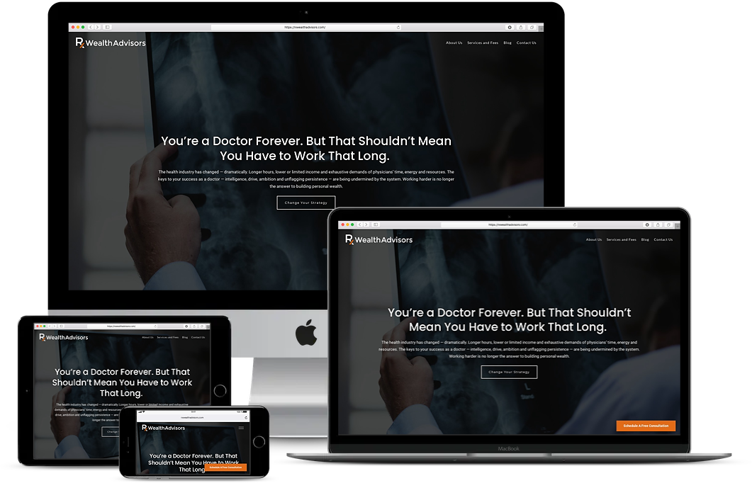
DRAW FOCUS (USING COLOR):
Notice the orange stripe running through “RX.” It’s a simple addition, but attention is drawn to the focus language of the target audience.
What colors do you use in your logo? Do you use any that might catch your viewer’s attention, like red, orange or yellow? Use these colors to draw attention to different areas of your logo, separate words, or focus on an audience.
2. Total Wealth Advisors
The same orange and blue color palette is used in the Total Wealth Advisors logo. The outline of downtown Minneapolis lets us know where the firm is located but also targets a local audience. It’s how these two elements interact that helped us choose this logo.
![]()

USE A LAYOUT TO SUPPORT IMAGERY:
The image of a logo will always be related to the larger meaning that you want to convey. The same goes for the wording in your logo. But deciding where to place them, in relation to one another, can give your logo that extra boost. In Total Wealth’s logo, the word “TOTAL” is encompassed by the city’s image, telling us they serve everyone, not a specific group of people.
When working with your logo, ask yourself if moving any of the elements might add or change the meaning. Imagine what the logo above might look like if the city was next to the title, rather than around it.
3. Mission: Advice
Mission: Advice‘s logo is pretty simple. It does something we all see a lot – a letter in the logo is replaced with another element. In this case, it’s a ship’s wheel. But we chose it because the simplicity of the logo does a few things you should keep in mind.
![]()

USE COLOR TO MAKE VISUAL CONNECTIONS:
Both “Advice” and the ship’s wheel use the same color. Not only does it tie together the logo, but it marries the meaning of the word to the image. The company’s mission is to steer you in the right direction.
Use the colors in your logo to connect different elements, whether it’s an object or another word. Remember an earlier tip when choosing which color to make this connection with, as color psychology can help. For example, if your goal was to show protection, then choose colors that relate to this feeling.
USE ADAPTABLE IMAGES:
Thanks to the logo, the firm’s values are linked to the image of the wheel, allowing the meaning to be carried anywhere. This is why the simplicity of the wheel is so beneficial – it can be used in other elements of branding. Mission: Advice‘s landing page does this in several areas, like replacing bullet points with the wheel.
Making an image adaptable isn’t only about placing it in different locations. For example, a single icon can help draw attention to a call-to-action, rather than including an entire logo and distracting from it. Remember, you can only do this if your logo is memorable.
4. Eagle Ridge Wealth Advisors
Eagle Ridge Wealth Advisors take to heart the tip above by creating an adaptable image. But we enjoy it because instead of tieing an image to the rest of the logo, they opted to create something that resembles a coat of arms. This way they can collapse their logo.
![]()

CHOOSE IMAGES THAT SUPPORT BRAND VALUES:
Everyone wants to trust their advisor and know that their money is safe. By using a coat of arms as their logo, Eagle Ridge draws on a shield to evoke a feeling of protection and safety.
The shield above is a great example. But other symbols can be used. Just remember to personalize it to avoid creating something cliche. For example, a tree might represent growth, but how can you implement it into your logo to highlight what makes your firm unique?
5. Thirty Mile Financial
We like the Thirty Mile Financial logo because it’s a perfect example of using your logo to set a tone for the rest of your branding. Minimal lettering, clear spacing, faded dark grey and a circular image evoke a feeling of calm.
![]()

BACKUP TONE WITH SHAPE PSYCHOLOGY:
Circular images are known to evoke feelings of harmony and repetition. Thirty Miles uses this abstract shape to back up the rest of their branding’s tone.
Shape psychology can provide a general feeling, so remember to use the other elements of your logo to ground that feeling and make it more specific.
CREATE A TONE TO OFFSET PAIN POINTS:
Financial management can be stressful, and anxiety around money can become a very real pain point for a lot of people. Reducing this anxiety is one of the benefits of money management. Thirty Mile chooses to highlight this benefit in its logo, connecting their brand with the solution.
The example of money anxiety is more general. But if you work with clients in a specific field, ask yourself what their concerns around money might be. What do they worry about that’s specific to their lifestyle?
6. Hobble Creek Wealth
Similar to the logo above, Hobble Creek Wealth‘s logo uses green and grey to evoke a sense of calm and provides some variation to the typical firm’s color palette. But what we love about this logo is how layout, shape and color psychology are used to complement one another.

INCORPORATE LETTERING INTO IMAGERY:
One of the first things you notice when looking at Hobble Creek’s logo is how the “H” and “C” of their brand are used to form a triangle. Triangles evoke feelings of improvement, growth and power – great emotions for money management. By forming the triangle from their logo letters, they connect the meaning to the firm.
Don’t force it, but are there ways that your logo could be adapted to fit your imagery? Many brands will even overlap different letters to create a unique symbol. This can be one way to add personalization to a more generic image.
USE LAYOUT TO MAKE YOUR LOGO MORE DYNAMIC:
Many logos choose to set their lettering on a horizontal line, similar to the logos above this. But by placing the typography of the Hobble Creek logo in a verticle line, the eye is drawn down, opposite of the triangle. This makes the logo more dynamic and interesting while remaining subtle.
Does anything in your logo draw your eye in a specific direction? In what way can you use this to your advantage? Just like using color to draw attention, different shapes can be used to direct attention towards specific elements.
7. Feathered Paddle Wealth Partners
Amongst so many other logos, Feathered Paddle Wealth Partners stands out. The color palette draws attention to the firm’s name by underlining it in blue. While the choice of a paddle as the main image and title creates curiosity.
![]()
PERSONALIZE AND CONNECT:
Consider the ways you can relate your brand values to your hobby image. Let’s use Feathered Paddle as an example, what does a feathered paddle do? It’s designed to have perpendicular blades, this way the blade not in the water is not being held up by the air. Ellen Fee, the founder of Feathered Paddle, connects this to wealth management:
Similar to this powerful paddle, women in various chapters of their life collaborate with us as their financial confidant — rather than confronting the unpredictable economic waters on their own.
Including an image of your hobbies or passions allows viewers to feel more connected with your brand. And amongst a variety of other firms, targetting a specific niche and showing personality is key to standing out. Consider what you enjoy outside of work, and see if you can implement it into your branding in a relevant way.
Updating Your Financial Advisor Logo (Or Making Your First One)
Whether you’re looking at updating your logo or creating a new one from scratch, keep these tips in mind.
KNOW YOUR BRAND:
It’s important that you know your brand inside and out when creating a logo. What are the colors? How can you create something that connects with your audience? What is the “tone” of your brand. Keep this information in mind when
KNOW YOUR AUDIENCE:
Similar to knowing your brand, it’s crucial that you know your audience when designing a logo. With this in mind, you can more easily create something that they can relate to or that really resonates with them.
TRUST YOUR DESIGNER:
Have a conversation with your logo designer and provide the information they need to create something amazing. At Twenty Over Ten, our design team works with advisors to help develop their brand identity through our logo design services for financial advisors. If you don’t have a designer, then consider using some of our favorite free logo design tools.
PICK A DESIGN STYLE:
Which design aesthetics do you want to go with when creating your logo? There are many styles:
- Classic
- Retro
- Modern
- Minimalist
Whatever you choose is important as it says a lot about your brand.
AVOID CLICHES:
Financial sites tend to use nature imagery. It makes sense, money management is stressful while nature is relaxing. A lot of the same ideas we apply to nature also relate to money management – growth, achievement and seasons are just a few examples. These images are fine to use, just make sure you don’t fall into a cliche.
LOOK FOR INSPIRATION:
Look around online, or use our guide to designing your logo. Find things you enjoy and adapt them to use in your own logo.
MAKE IT MEMORABLE:
Will people be able to remember your logo? Think about some of the biggest brands out there and all you have to do is see their logo and you will know who it is.
KEEP IT SIMPLE:
You probably want to go “all out,” but simplicity is important so that it doesn’t appear to be cluttered. Make use of one or two colors, fonts or designs. And by keeping it this way, will also help it to stand out more.
KEEP UP WITH THE TRENDS:
The new year brought a variety of new logo trends, with animation being one of our favorites. Check out our post on the logo trends of 2020 and see if any work for you.
TELL A STORY:
Story-telling is such a huge part of marketing and your brand, so make sure your logo tells a story. What is going to really stick with your audience and resonate with them? Every company has a story to tell and if you can do that with your logo, then it’s really going to stand out in a good way.
Wrapping It Up
Great logos draw on similar strategies. What makes these logos different, is how they use these elements to complement one another. Remember to keep this in mind when designing your first logo, or updating your current one.