
Trending

Written by: Stephanie Aliaga
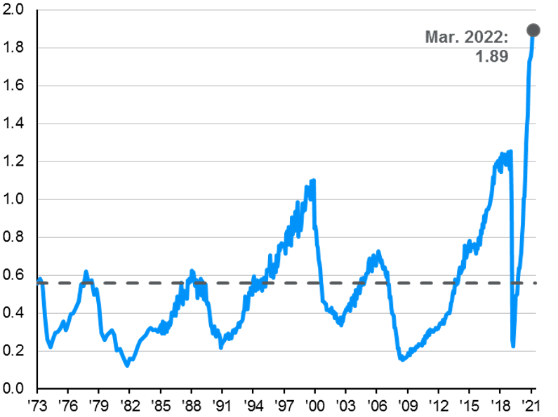
The March employment report contained a host of figures pointing to the strength of the U.S. labor market. However, arguably the most important single indicator of this strength, the ratio of job openings to job seekers, isn’t found in any published government report, although Chairmen Powell cited this more than once at his recent press conference. Our research using historical analysis going back to the 1970s suggests that by this measure, the labor market is the hottest it’s been in the last 50 years.
First, on the March jobs report itself:
- Employers added 431,000 jobs in March, slightly lower than consensus expectations of 490,000 but still impressive given upward revisions of 95,000 to the prior two months.
- The unemployment rate fell from 3.8% to 3.6%, lower than in all but 5 months of the last 52 years. Importantly, this means the unemployment rate is now just 0.1% above the Fed’s 3.5% forecast for both the end of 2022 and 2023.
- Average hourly earnings grew by 0.4%, in line with consensus expectations. However, with an upward revision to the February numbers, the year-over-year gain in average hourly earnings hit a recovery high of 5.6%.
- Women are returning to the job market. The labor force participation rate for prime age women, aged 25-54, jumped to 76.5%, the highest level since February 2020. The jobs recovery for women has been hindered by a lack of affordable childcare and elder care throughout the pandemic.
- The labor force grew by 418,000 people, but this mostly reflects a 357,000 drop in the number of people who were not looking for a job because of the pandemic. As pandemic effects recede, this suggests that higher wages may have a limited impact in drawing more workers back into the labor force, which could mean mediocre labor force growth in the months ahead.
In the Press Conference following the March FOMC meeting, Chairmen Powell cited the ratio of 1.7 job openings for every unemployed person as evidence of “a very, very tight labor market—tight to an unhealthy level, I would say”. That ratio is now at 1.9 with the March employment report. The reason this statistic is not cited more often is because the JOLTS report has only been conducted since 2000, making farther dated historical comparisons impossible. However, there is a very strong relationship between the National Federation of Independent Business (NFIB) survey on the percentage of businesses with open positions and the JOLTS job openings series. By exploiting this relationship and backcasting to the start of the NFIB survey, we are able to calculate an estimated number of job openings going back to the 1970s, as we show in the first chart below. Further, when you compare the ratio of these job openings to job seekers in the following month, the labor market in March 2022 was the hottest labor market since at least the mid-1970s and very likely much further back than that.
It’s going to take a while to get the labor market back to more balanced demand and supply, particularly given structural demographic factors hampering labor force growth, and in the meantime we are going to see continued upward pressure on wages. For investors, signs of a very tight labor market likely mean an even more hawkish Fed and higher interest rates in the months ahead, but they also should inspire some confidence in the economy’s ability to absorb those hikes without a recession.
Historical JOLTS job openings
Job openings implied by the NFIB % of businesses with open positions

Ratio of job openings to job seekers
Related: What Are the Opportunities in Sustainable Transportation?
Source: BLS, National Federation of Independent Business, Department of Labor, J.P. Morgan Asset Management. *JOLTS Job Openings from Feb. 1974 to Nov. 2000 are J.P. Morgan Asset Management estimates. Data are as of April 1, 2022.