

Trending

Get the charts. Subscribe to the Market Intel Exchange.
Midterm midyear market pattern
What this chart shows:
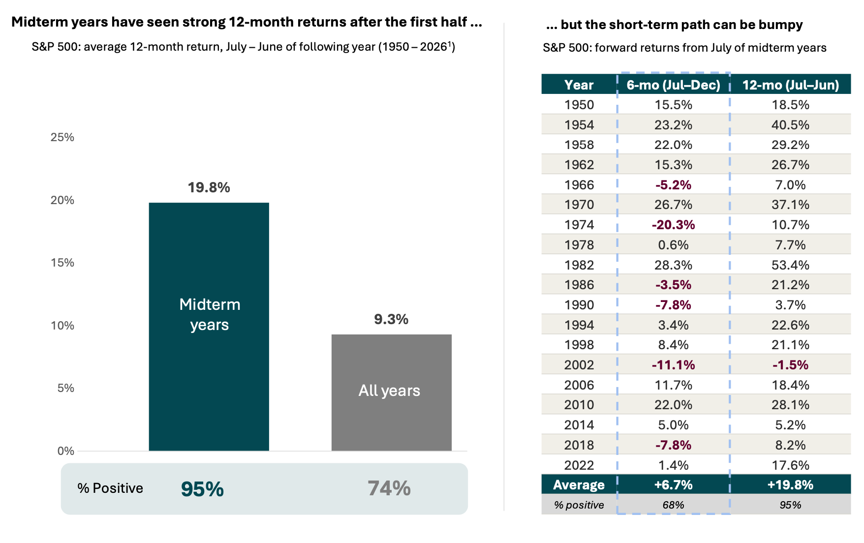
The chart on the left compares the 19 midterm election years vs. all years since 1950, showing the S&P 500’s average return and how often it was positive from July – June of the following year.
The table on the right shows each midterm year, along with the 6- and 12- month returns from the start of the second half of each year.
Why it matters:
The second half of midterm years has often been choppy.
Roughly a third of instances since 1950 were negative, and the worst six-month stretch fell more than 20% (1974).
Twelve months out (July through the following June), the picture has improved. Returns in midterm years averaged more than double a typical year, and all but one instance was positive (-1.5% from July 2002 – June 2003).
In fact, even 1974, the midterm year with the worst second half, still finished the 12-month period from July of that year through June of the following year with a gain of more than 10%.
Source: Morningstar, analysis by Lincoln Financial. (1) S&P 500 Price Return Index from 1950 – June 2026. Forward returns measured from July 1 of each year through June 30 of the following year. Past performance does not guarantee or predict future performance. You cannot invest directly in an index.
Related: The Diversification Advantage Investors Counted On Is Changing