
Trending

Written by: Przemyslaw Radomski, CFA
Does gold’s most recent rally and the inflow of capital into silver change the fundamental outlook of the PMs? If so, what about equities?
In short, yes, the U.S. dollar is down, thereby boosting gold. Yes, the recent massive interest in silver has everyone talking about getting in on the action. However, one must remember that markets don’t move in a straight line and countertrend rallies are expected along the way. Keep your eye on the ball. Now, let’s examine what exactly is happening.
Gold moved higher once again yesterday (Feb. 9), but it reversed and declined before the closing bell. Miners declined as well. Does it mean that the next top is in or about to be in? That’s exactly what it means. Especially considering that gold’s reversal took place almost right at the triangle-vertex-based reversal and during USD’s breakout’s verification.
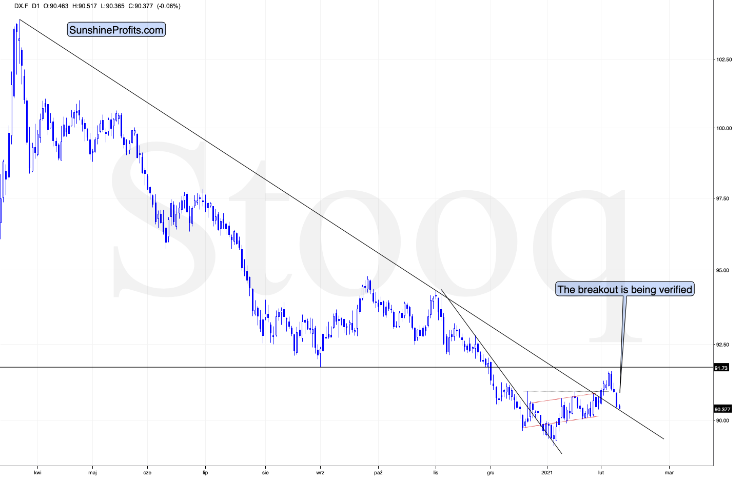
Figure 1 - USD Index
I previously wrote that because assets don’t move in a straight line, it’s plausible that the USD Index retests its declining resistance line, while gold retests its rising support line. If this occurs, the USDX is likely to decline to the 90.6 range, while gold will receive a short-term boost . I emphasized that the outcome does not change their medium-term trends and the above confirmations signal that the USDX is heading north and gold is heading south.
The part that I put in bold is exactly what is being realized right now. The USDX is correcting after the breakout, likely verifying the previous resistance as support.
Unless the USDX breaks back below the declining medium-term support line in a meaningful way, the bullish implications for the following weeks will remain intact. At the moment of writing these words, the USD Index is practically right at the support line, which means that it’s quite likely to reverse shortly.
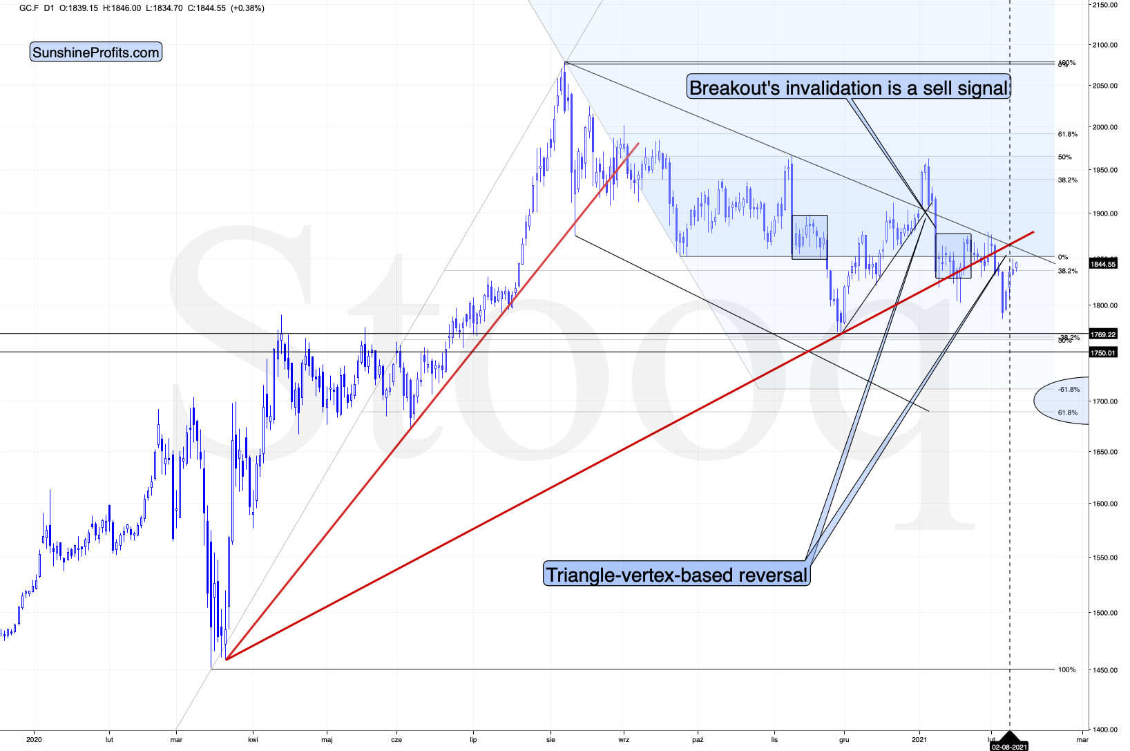
Figure 2 - COMEX Gold Futures
Gold formed a reversal yesterday, but it ended the session slightly higher. The latter might seem bullish, until one compares that to the size of the daily decline in the USD Index. The move lower in the latter was quite visible, so what we saw in gold should be viewed as USDX’s underperformance and thus a bearish sign.
Let’s keep in mind that gold was just at its triangle-vertex-based reversal (based on the declining black resistance line and the rising red support line), which perfectly fits the shape of yesterday’s session – the shooting star reversal candlestick. The implications are bearish.
Today, gold moved slightly higher, but the move was too small to change anything. Gold didn’t move above yesterday’s intraday high, which means that the short-term top might already be in.
What about silver, did the white metal change anything?
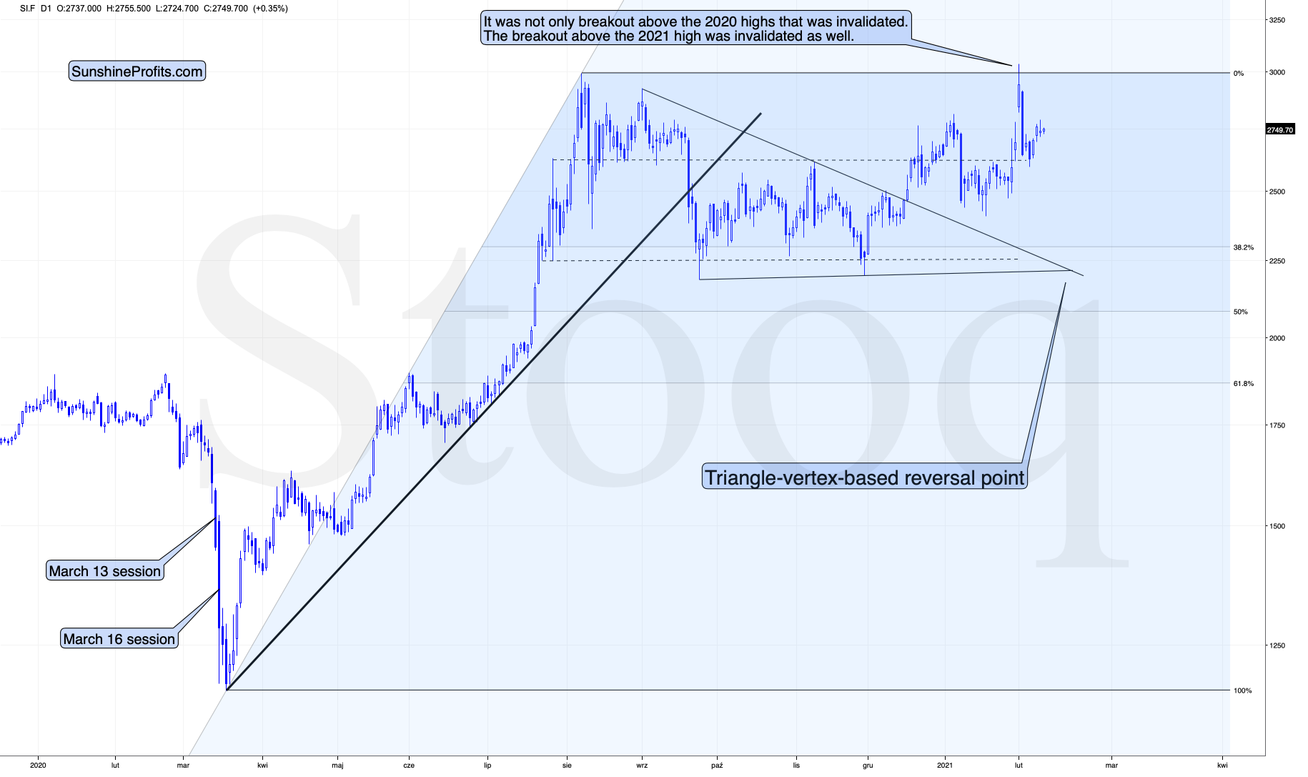
Figure 3 - COMEX Silver Futures
Not really. Just like gold, silver is taking a breather after the increased volatility. This is normal.
Speaking of silver, please note how big the silver inflows were last week.
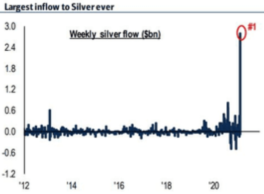
Figure 4
This might seem bullish at first sight – a lot of capital entering the silver market is bound to push the silver price higher, right?
Wrong. This could simply be an indication of a temporary (yet massive) increase in the white metal’s potential (which no doubt will be realized, but not necessarily yet), which is something that we tend to see at market tops along with increased interest in terms like “ silver squeeze ” or “ silver manipulation ”.
Please compare the first spike that you can see on the above chart with what silver did next (on the following chart).
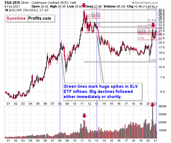
Figure 5
Silver declined severely in the first half of 2013. Also please note that at that time, the silver market was already well after the massive monthly volume spike. We saw the same thing in mid-2020.
The outlook for silver is very bullish for the next years, but the implications of the above factors are very bearish for the medium term.
This is especially the case, since silver and mining stocks tend to decline particularly strongly if the stock market is declining as well. And while the exact timing of the market’s slide is not 100% clear, stocks’ day of reckoning is coming . And it might be very, very close.
Eyes Wide Shut
As the NASDAQ Composite records yet another all-time high, investors are sleepwalking through one of the most dangerous equity markets ever.
On Feb. 4, I warned that fund managers’ cash positions were frighteningly low.
I wrote:
Mutual fund managers are now holding less than 2% of their portfolios in cash – an all-time low.
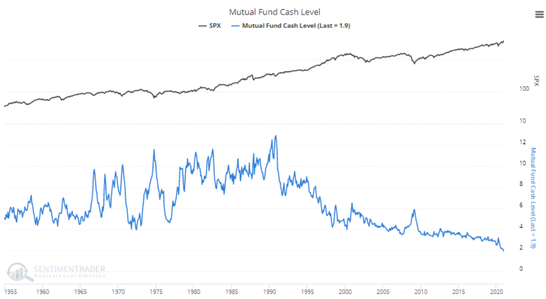
Figure 6 - Source: SentimenTrader
Moreover, with fear of missing out (FOMO) taking a sledgehammer to valuation, pension funds are also following the bad behavior. If you analyze the chart below, you can see that pension fund cash positions have fallen to 2.6% – also an all-time low.
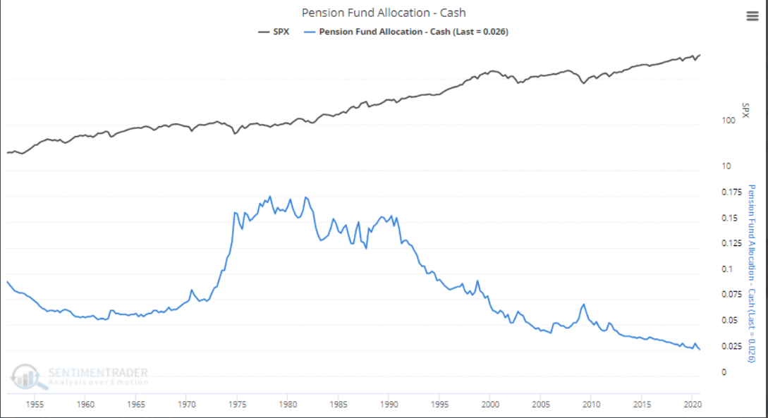
Figure 7 - Source: SentimenTrader
And with daydreams of riches continuing to transfix rationality, the upward inertia has left equity bears nearly extinct. As of Jan. 15 (the latest data available), S&P 500 short interest has hit its lowest level since the peak of the dot-com bubble.
Please see below:
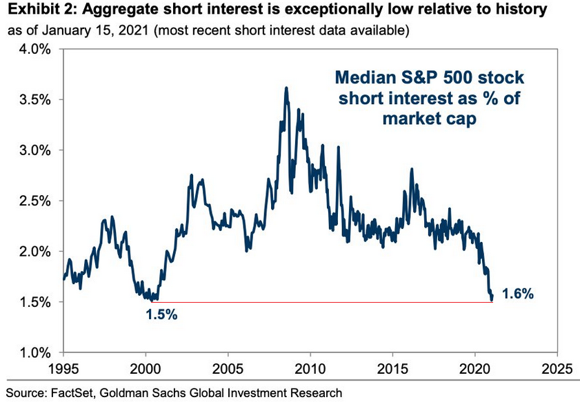
Figure 8
To explain the importance, fund managers’ cash positions and short sellers are akin to airbags in your car. In the event of a crash, airbags serve their purpose by cushioning the blow. Similarly, when the market crashes, short-sellers cover their positions (by purchasing the underlying asset), helping to alleviate the downward impact. Similarly, when fund managers’ cash positions are high, they have more ‘dry powder’ at their disposal to hit the bid and support prices. As a result, with both variables being excommunicated, nearly every investor is now driving with their pedal to the metal.
Also encapsulating the speculative euphoria, last week, technology companies recorded their highest-ever weekly inflow.
Please see below:
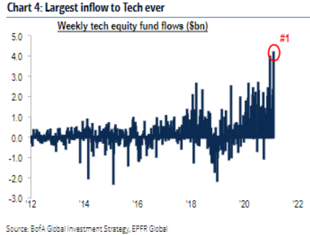
Figure 9
And not to be outdone, the Russell 2000 (a proxy for U.S. small caps) is also earning its fair share of speculative gold medals. On Feb. 4, I warned that money was pouring into companies that are on the brink of financial distress.
I wrote:
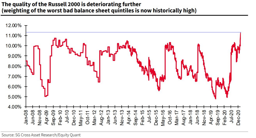
Figure 10
The red line above represents companies with ‘weak balance sheets.’ Essentially, these are companies with high leverage ratios that rely on a strong economic backdrop to service their debt. At the end of 2019, these companies made up roughly 6% of the Russell 2000 index. Today, that figure has nearly doubled to an all-time high of more than 11%.
Moreover, amid investors’ foray into the riskiest corners of the U.S. equity market, they’ve also bid the Russell 2000 (as of Feb. 8) to more than 39% above its 200-day moving average (also an all-time high).
Please see below:
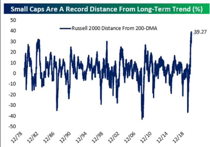
Figure 11 - Source: thedailyshot.com
Ignoring a sound diet, bond investors also continue to feast on junk food. On Feb. 8, the average yield on junk bonds (represented by Barclays U.S. Corporate High-Yield index) fell below 4% for the first-time ever.
Please see below:
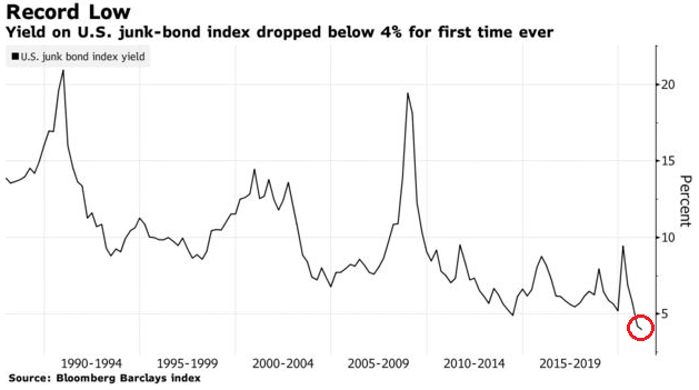
Figure 12
In addition, issuances of CCC-rated debt – the riskiest tier of junk – have been massively oversubscribed , as yield-hungry investors throw caution to the wind. More importantly though, the frenzy has lured even riskier companies to the market, with the group raising a record $52 billion in January alone.
Even more indicative of the reckless behavior, the riskiest companies are also negotiating the riskiest loan terms. Peddling payment-in-kind (PIK) interest, junk bond issuers are now paying investors with IOUs. Unlike traditional bonds, where fixed cash flows are paid at pre-defined dates, PIK bonds are essentially loans on top of loans. Here, investors forego cash payments and add hypothetical interest payments to their bond’s principal balance. Then, at maturity, investors receive the entire proceeds.
And what’s the problem?
Well, as I’m sure you can tell, the IOUs are worthless if insolvency strikes first.
Moving up the speculative ladder, in January, small traders bought call options at nearly 9x their 2019 pace. For context, ‘ s mall traders’ purchase 10 or less call option contracts and have exposure to 1,000 shares or less. As such, they’re usually the least sophisticated market participants.
But because their Delta/Gamma splurge continues to impact dealers’ hedging activity, U.S. equity volume has gone completely parabolic. On Feb. 8, U.S. equities (trading at record prices) exchanged hands at nearly 4x their historical average.
Please see below:
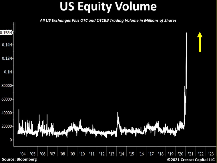
Figure 13
In addition, as more and more first-time buyers dip their toes into the equity pool, the ripple can be felt across Google Search trends. As of Feb. 8, online searches for “penny stocks” have exploded.
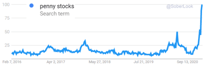
Figure 14 - Source: thedailyshot.com
Even more telling, retail interest in the stock market usually peaks during bouts of volatility. In a nutshell: when the stock market crashes and news outlets cover the story (that otherwise wouldn’t during normal times), it piques the interest of the general public. As a result, crashes tend to bring about investing tourists.
Please see below:
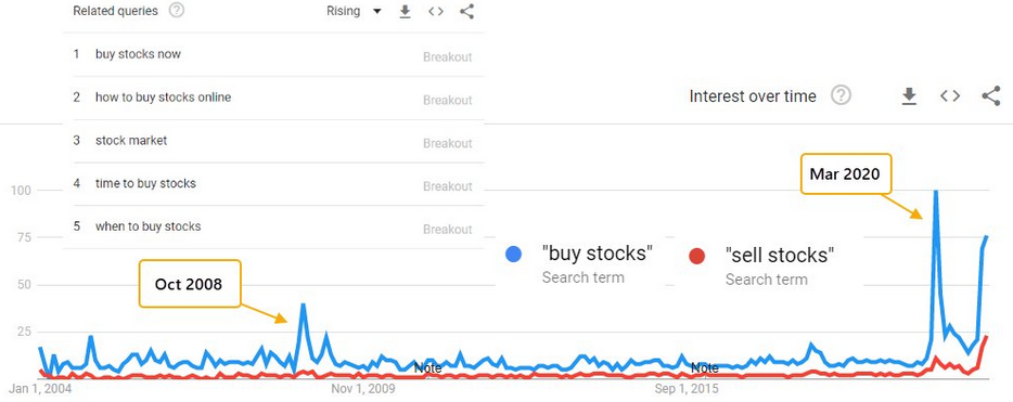
Figure 15 - Source: SentimenTrader
To explain the chart above, the blue line depicts the trend in “buy stocks” in Google searches over the last ~17 years. If you analyze the first two spikes in October 2008 and March 2020, they occurred alongside extreme market stress. However, if you look at the third spike on the right side of the chart (almost as high as March 2020), it’s occurred alongside U.S. equities current melt-up.
The key takeaway?
As the equity bubble grows larger, it’s sucking in more and more unsophisticated investors. However, as 2000 proved, overconfidence can give way to fear at the blink of an eye.
As the final chart in today’s edition, investors’ belief in a utopian future has also come full circle.
Please see below:
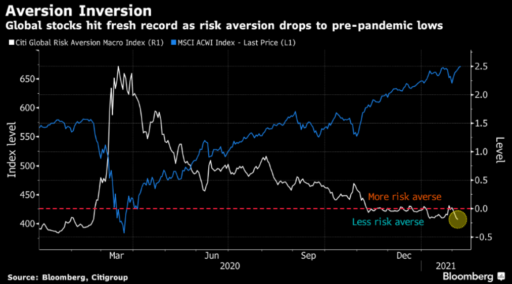
Figure 16
To explain, the white line above depicts the movement of Citigroup’s Global Risk Aversion Macro Index – which uses credit spreads, swap spreads and implied volatility to quantify investors’ perception of risk. As you can see, the index is now back to its pre-pandemic lows. More importantly though, the reading encapsulates all of the above and highlights the excessive complacency underwriting global equities.
In conclusion, global stocks are living on a razor’s edge and their margin for error continues to dwindle. And due to gold and silver’s moderate-to-strong correlation with the S&P 500 (250-day correlations of 0.71 and 0.87 respectively), one false step could knock over the entire house of cards. As a result, it’s prudent to consider these cross-asset implications when assessing the future performance of the precious metals. However, once the events reach their precipice, the PMs will be able to resume their long-term uptrend.
Thank you for reading our free analysis today. Please note that the above is just a small fraction of today’s all-encompassing Gold & Silver Trading Alert. The latter includes multiple premium details such as the targets for gold and mining stocks that could be reached in the next few weeks. If you’d like to read those premium details, we have good news for you. As soon as you sign up for our free gold newsletter, you’ll get a free 7-day no-obligation trial access to our premium Gold & Silver Trading Alerts. It’s really free – sign up today.
Related: What’s Next for the Silver Roller Coaster?
The views and opinions expressed in this article are those of the contributor, and do not represent the views of IRIS Media Works and Advisorpedia. Readers should not consider statements made by the contributor as formal recommendations and should consult their financial advisor before making any investment decisions. To read our full disclosure, please click here.